What is ArcGIS AllSource?
The answer for actionable intelligence
Disparate data is a constant variable in the intelligence community. Information can flood analysts from every direction, with some sources being useful, and others not. How do we figure out which information is which? How do we assimilate what information is useful and reject what is not? Most importantly, how can we turn this information into actionable intelligence?
ArcGIS AllSource is an intelligent application that can help answer these questions. Developed with the intelligence analyst in mind, ArcGIS AllSource uses a streamlined user interface and tools that help you visualize data that would otherwise remain unseen. ArcGIS AllSource is an application built for the intelligence community to create actionable intelligence from disparate data.
On the shoulders of giants
ArcGIS AllSource is a stand-alone application that was developed from the solution configuration, ArcGIS Pro Intelligence. ArcGIS Pro Intelligence was created to help bridge the gap between GIS applications and intelligence applications. It was developed to answer different questions than those of ArcGIS Pro, namely, the questions asked by the intelligence professional.
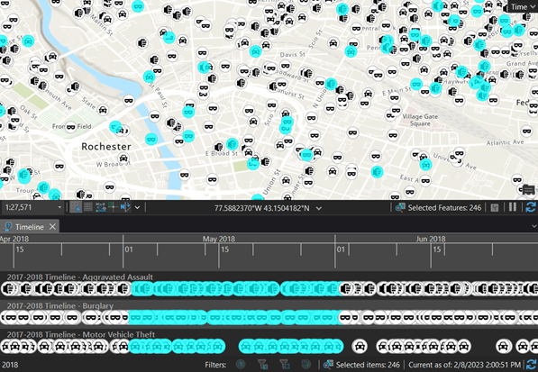
In ArcGIS AllSource, you can analyze temporal data by creating timelines. Timelines complement the map by showing where data falls along a linear temporal axis. In addition, selections you make within the timeline are displayed on the map, giving temporal and spatial understanding.

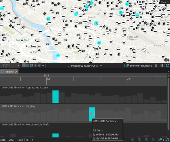
By using the summary view in your timeline, you can view your temporal data as a histogram. This histogram is a chart that represents data along a temporal axis where you can specify the distribution of data into temporal ranges, allowing you to analyze trends that could be overlooked.

Timelines aid analysts by visualizing temporal data, however, how do we visualize relational data?
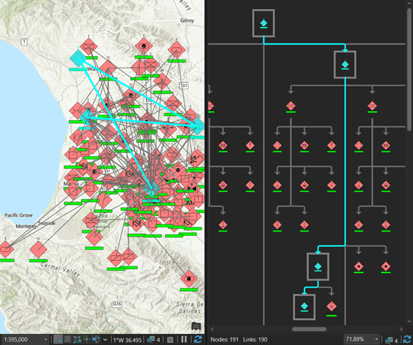
Link charts allow you to visualize connectivity and relationships. By creating a link chart, you can see the unseen and make sense of nonspatial information within your data. Link charts are composed of nodes and links. Nodes represent people, places, and things; links represent the relationship between the nodes. For example, in the following image, you can see an order of battle displayed within a link chart and the unit relationships on the map.

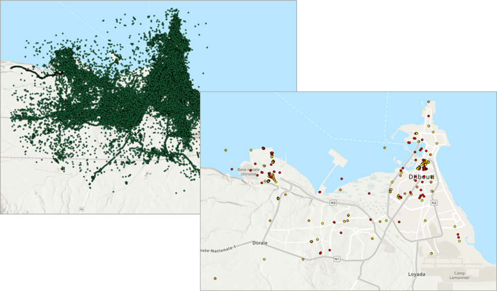
Furthermore, you can track the movement of entities and determine co-travellers and movement patterns. The Find Cotravelers tool was developed to detect people of interest travelling together at the same time. In the tutorial Investigate a crime by finding co-travellers, Thomas Oaks shows us how to take more than 1 million data points and find our co-travellers and their last locations. All this can be done in both connected and disconnected environments.

In ArcGIS AllSource, we took the feedback from a solution configuration and developed a fully supported stand-alone application around those needs. The tools you may already know about, such as the ones mentioned earlier, have been improved with additional functionality and investigative workflows. ArcGIS AllSource is the next stage of evolution for a GIS and intelligence application; it capitalizes on feedback while developing tools and workflows that best aid the intelligence analyst from any industry. ArcGIS AllSource stands on the shoulders of giants, and the view is phenomenal.
Banner photo by sk on Unsplash
Related resources
To learn more, visit the ArcGIS AllSource website.
For help migrating to ArcGIS AllSource see the ArcGIS AllSource Migration Guide.
For more information implementing ArcGIS AllSource see the ArcGIS AllSource Implementation Guide.