Tackling Healthcare Network Accessibility with ArcGIS Knowledge
Diabetes is the most expensive chronic condition in the United States. As of 2017, direct medical costs are $237 billion dollars annually, according to the Centers for Disease Control and Prevention (CDC). Federal, state, and local agencies and commercial health organizations are implementing strategies that work to reduce the impact of diabetes through early diagnosis, intervention, and prevention. However, some communities are still falling behind.
Identifying why early intervention strategies are not working and addressing barriers in these communities can radically improve patient health outcomes and reduce healthcare spending. Healthcare organizations already have a lot of data about their provider networks and patient behaviours, but the large volume of data and the variety of different data sources make it very challenging to analyze. This is where ArcGIS Knowledge can help. ArcGIS Knowledge is an enterprise capability for using graph and spatial analysis methods to answer deceptively simple questions in complex data. By simply connecting their existing data in ArcGIS Knowledge, health agencies can explore these large sets of disparate data to find meaningful connections and patterns to reveal potential barriers to access.
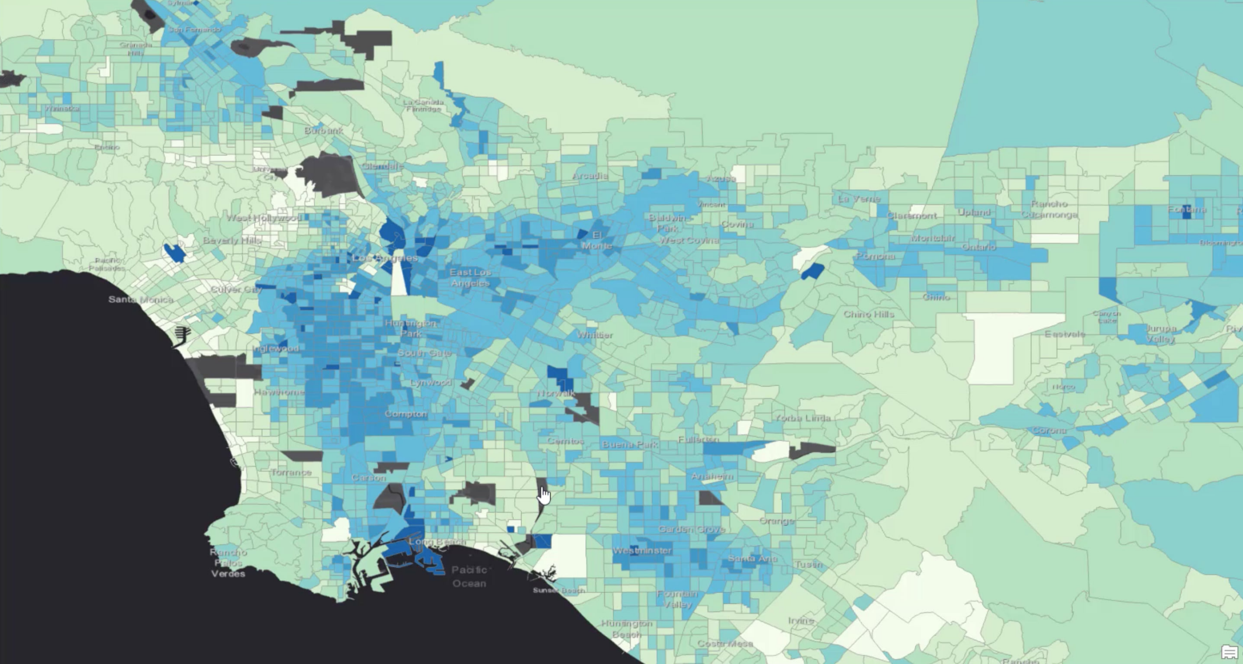
In this example, we are using ArcGIS Knowledge to analyze a healthcare insurance provider’s network to identify barriers to treatment. To illustrate how this works, we used synthetic health records generated by Synthea to simulate the real-world accessibility of an insurance provider’s healthcare network. As a baseline, the map above displays estimated CDC Places data on diabetes prevalence in the greater Los Angeles area and the dark blue areas have the highest presence of the disease.
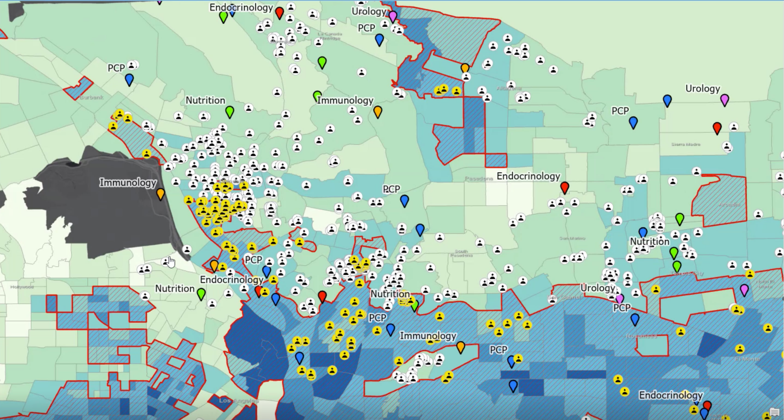
When a patient is first diagnosed with diabetes, they can be referred to a specialist like a nutritionist. Nutritionists can help contribute to better outcomes for patients and help lower overall healthcare expenses. For this reason, we concentrated on areas that have the highest prevalence of adults with diabetes outlined in the red boundaries.
Powerful Spatial and Graph Analysis
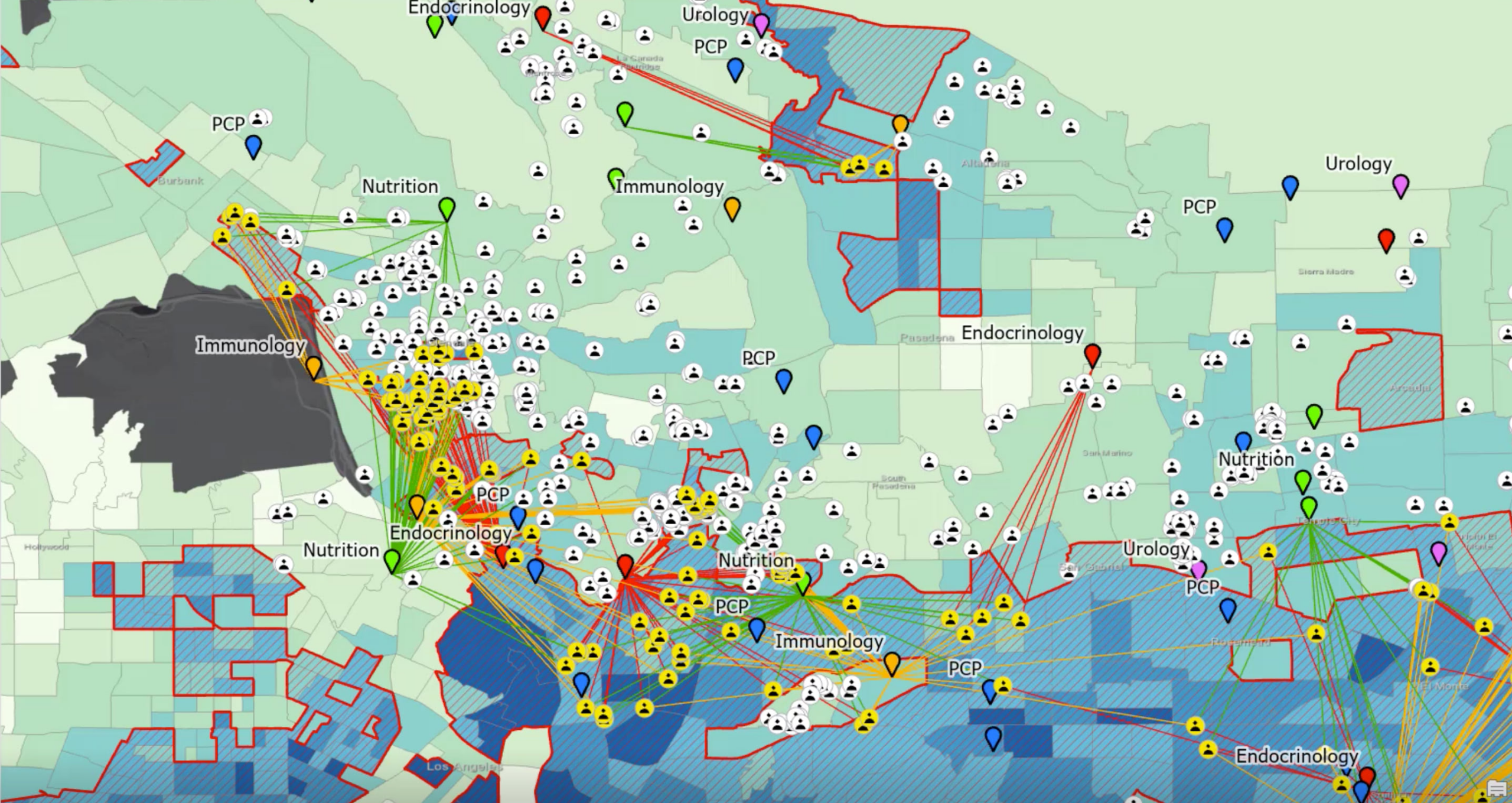
We identified patients and providers within critical high-risk areas by intersecting healthcare records with the CDC layers. We also ran spatial analyses on the patients and providers to identify the closest specialist for any patient living in high-risk areas. Next, we calculated the time it would take for each patient to drive to each provider and identified the closest provider for each speciality. Last, we created a knowledge graph to connect the Patients and Providers based on three different types of relationships:
- A Patient visited a Provider
- A Patient was referred to a Provider
- A Patient is geographically closest (has the shortest drive time) to a Provider
With the data connected in the graph, we are able to look for different patterns of relationships which help us to understand patient behavior. We see some patients are being referred to providers who are geographically farther away though closer providers are available. Some patients are not being referred to specialists of any type at all. We are also able to see some areas that have a high concentration of diabetes do not have a specialist located anywhere nearby. Knowledge graphs make it easier to understand these types of relationships and patterns.
Revealing Access Opportunities
We know one reason a patient might not receive health care is proximity. If there is not a nutritionist nearby, or a patient doesn’t have access to reliable transportation, the patient is less likely to receive the care they need. We understand location matters. The question becomes, why would we refer a patient to a doctor that is geographically far away?
Results of Analysis
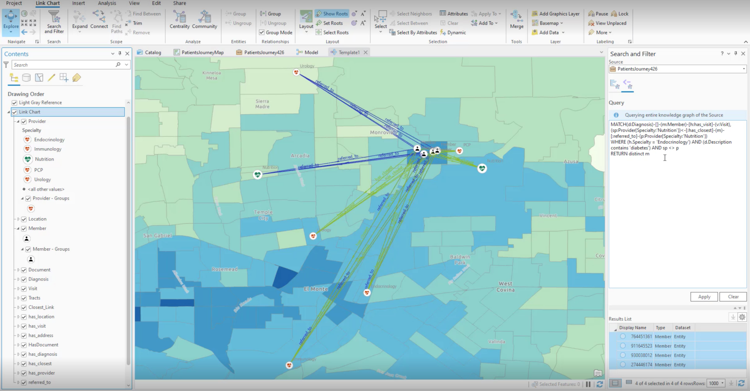
To discover this pattern in our data, we used a graph query to find diabetic patients who were referred to a nutritionist, didn’t go, and had a nutritionist available within a shorter drive. The graph query returned four patients matching this description shown in the map below.
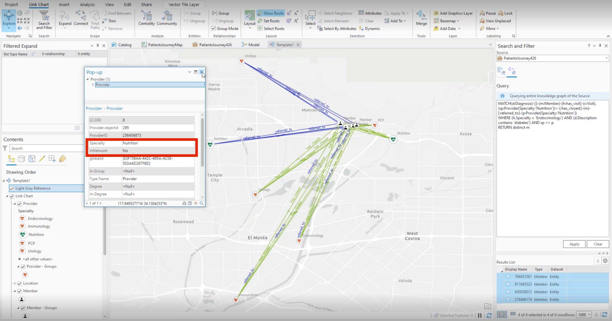
In all cases, the closer nutritionist was out of network for the patient’s insurance policy. The distance to see an in-network physician is too far for the patient and prevents them from continuing with early intervention programs.
One concrete action the insurance carrier could choose is to bring the closer nutritionist into their provider network. Reviewing the results of the graph overlaid with the mapped CDC data would show the concentration of people living with diabetes in this specific area to justify if this decision is feasible. If it is, this would support intervention at an earlier stage limiting complications down the line, improving patient outcomes in this community, and reducing overall healthcare costs.
ArcGIS Knowledge Improving Network Accessibility
With ArcGIS Knowledge, analysts can investigate healthcare network adequacy and potential optimizations to improve patient outcomes and reduce costs. ArcGIS Knowledge helps healthcare providers improve decisions by bringing the geographic approach to the knowledge graph. This method can be used across other communities where patients may be unable to access lower-cost early interventions. Analysts can identify and query patients across all different specialities and health conditions to understand and respond to the needs of their patients across all communities. ArcGIS Knowledge enables analysts to discover these types of patterns at scale. To learn more about ArcGIS Knowledge reach out to your Esri representative.